visualizing statistics in ssms
estimated read time: 4-5 minutesDBCC SHOW_STATISTICS
While it may not be fun, running DBCC SHOW_STATISTICS can tell you a lot about how the query optimizer might use a given index, or why certain queries are more susceptible to parameter sniffing.
If you are the visual type like myself you have probably taken the output from this command and pasted it into Excel to create a bar chart. This can be an extremely easy way to get a quick look at the statistics to see how evenly the column values are distributed in the B-Tree, but who wants to waste time opening Excel?
With the following script you can use SSMS's built-in drawing capabilities to create a histogram you can view right inside SSMS:
DECLARE @TableName      VARCHAR(128)
DECLARE @StatisticsName VARCHAR(128)

SET @TableName = ''
SET @StatisticsName = ''

DECLARE @SQLCmd         VARCHAR(2048)
DECLARE @ScaleFactor    NUMERIC(8,8)
DECLARE @StatH          VARCHAR(MAX)

/*
This script will draw a graphical histrogram for the given statistics.
Just provide a table name, and the name of the statistics you are
interested in and you will get a bar chart of the value distribution.

After executing the script, click on the "spatial results" tab to see the
chart.
*/

CREATE TABLE #histogram
(
    ID INT IDENTITY(1,1),
    [RANGE_HI_KEY] SQL_VARIANT,
    [RANGE_ROWS] SQL_VARIANT,
    [EQ_ROWS] SQL_VARIANT,
    [DISTINCT_RANGE_ROWS] SQL_VARIANT,
    [AVG_RANGE_ROWS] SQL_VARIANT
)

SET @SQLCmd = 'DBCC SHOW_STATISTICS ("'+ @TableName + '","' + @StatisticsName + '") WITH HISTOGRAM'

    INSERT INTO #histogram EXEC(@SQLCmd);

--== To keep things visible I scale the RANGE_ROWS value
--== down if needed
SET @ScaleFactor = (SELECT CASE WHEN MAX(CAST(RANGE_ROWS AS BIGINT) + CAST(EQ_ROWS AS BIGINT)) > 100 THEN 100.0/(MAX(CAST(RANGE_ROWS AS BIGINT) + CAST(EQ_ROWS AS BIGINT))) ELSE 1 END FROM #histogram)

--== This constructs an enormous string of coordinates, one
--== set per shape:
SET @StatH =
STUFF(
    (SELECT ',((' +
CAST( ID AS VARCHAR(30) ) + ' 0,' +   -- Bottom left
CAST( ID AS VARCHAR(30) ) + ' ' +   CAST( CAST(RANGE_ROWS AS BIGINT) + CAST(EQ_ROWS AS BIGINT) * @ScaleFactor AS VARCHAR(30) ) + ',' + -- Top Left
CAST( ID + .75 AS VARCHAR(30) ) + ' ' + CAST( CAST(RANGE_ROWS AS BIGINT) + CAST(EQ_ROWS AS BIGINT) * @ScaleFactor AS VARCHAR(30) ) + ',' + -- Top Right
CAST( ID + .75 AS VARCHAR(30) ) + ' 0,' + --Bottom Right
CAST( ID AS VARCHAR(30) ) + ' 0))' -- Back to the start, bottom left
FROM #histogram
ORDER BY ID
FOR XML PATH('')), 1, 1, '');

--== MULTIPOLYGON allows us to draw multiple shapes from
--== a single string
SELECT  geometry::STGeomFromText( 'MULTIPOLYGON(' + @StatH + ')', 0 ) AS GraphData;

--== Dumping the raw histogram data as well
SELECT
    ID,
    RANGE_HI_KEY,
    RANGE_ROWS,
    EQ_ROWS
FROM #histogram;

DROP TABLE #histogram;
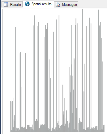
To use the above query simply input the table and statistics you are interested in seeing and execute it, the graphical histogram will appear in the "Spatial Results" tab. For this example we are going to use the AdventureWorks2012 database and take a look at the statistics for the IX_SalesOrderDetail_ProductID on the Sales.SalesOrderDetail table:

In the image above you can see the "Spatial Results" tab at the top, and the graphical view of the histogram in the results area. Each line in the chart represents a step in the histogram. Using this quick visual tool you can eaily see how "balanced" your histogram is. In cases where it is highly unbalanced, like in the example, queries written that use compare a parameter value to the value in this column could be highly susceptible to poor parameter sniffing.
So how does this all work?
The Spatial Results tab shows geometric (spatial) data. Spatial data is great for storing things like map data, but in the end it's just a collection of connected points on a plane. What the above script is doing is simply plotting out a line for each step in the histogram and drawing it as a narrow box. When all the boxes are arranged next to eachother we end up with a bar chart.
Further Resources
Statistics are an interesting and important component of SQL Server, below are some resources to help you better understand statistics as well as learn more about displaying spatial data in SSMS.
Inside the Statistics Histogram & Density Vector @ www.sqlpassion.at/
Statistics in SQL Server @ www.simple-talk.com
Generating Charts and Drawings in SQL Server Management Studio @ www.sqlmag.com
The Elephant and the Mouse, or, Parameter Sniffing in SQL Server @ www.brentozar.com